Main typeface GT America and supplementary decorative typeface Damion
Choosing the right font is essential for a strong brand identity. It conveys values, supports brand recognition, and ensures a consistent visual language. At Mootes, we have chosen GT America as the primary font and Damion as an accent font. This combination blends modern clarity with a nostalgic touch, reflecting our commitment to quality, tradition, and innovation.
Why GT America for Mootes?
GT America is a perfect fit for Mootes as it exudes both masculinity and confidence while maintaining an element of elegance and modernity. The combination of bold and fine styles allows us to adapt our brand’s visual presence—whether for striking advertisements or subtle details on product packaging.
About GT America and its use
GT America is a typeface family by Grilli Type that combines the best of American grotesque typography with European neo-grotesque precision. It merges functional clarity with strong visual presence, making it the perfect choice for Mootes’ brand communication. The mix of wide and condensed styles gives our design flexibility and dynamism.

GT America Compressed Regular

GT America Compressed Medium

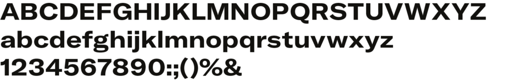
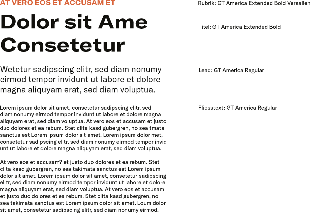
GT America Regular

GT America Condensed Light

GT America Condensed Bold
GT America Extended Bold
Our Font Weights & Styles
We use a selection of font styles to cover different application scenarios:
- GT America Compressed Regular: This cut is used for compact body text and information-dense areas where space is limited. It offers high readability while maintaining a space-efficient layout, ensuring a clear and functional appearance.
- GT America Compressed Medium: This variant is ideal for precise emphasis and structuring text elements in compact layouts. It provides a slightly stronger presence while remaining controlled, making it suitable for subheadings or highlighted information.
- GT America Condensed Light: This elegant typeface offers a refined, modern feel, mainly used for subtle, informative text or stylish branding elements.
- GT America Condensed Bold: Ideal for compact yet striking typography. Used for subheadings and accent text, especially when space is limited.
- GT America Regular: The standard version for body text and informative content, ensuring high readability and a clean, professional look.
- GT America Extended Bold: Used for bold headlines and branding elements. Its wide, strong appearance ensures a powerful visual impact.
Usage & Consistency
Consistent use of these fonts across all media—from the website to packaging and social media posts—strengthens the Mootes brand. It helps create high brand recognition and ensures uniform communication with our target audience.
Supporting Accent Font (Damion) & Its Purpos
Damion is a handwritten script font that conveys a charming vintage character. It adds a nostalgic touch to the design without appearing overly playful. This font enhances Mootes’ identity by adding warmth and individuality, reinforcing the brand’s classic craftsmanship image.

Damion Regular
Use of Damion
Though used sparingly, Damion still holds a strong visual presence. Its distinctive handwritten style highlights key words and gives our packaging and marketing materials a unique character.
Usage Areas:
- On product packaging for names such as Mountain Pass, Hidden Beach, etc.
- Targeted use in promotional materials to add stylistic accents.
- Complementary to GT America, adding a vintage touch.
Why Damion for Mootes?
Damion is the ideal choice for specific design elements because it provides a handcrafted look reminiscent of old advertising posters and traditional craftsmanship. It pairs perfectly with GT America, creating a contrast between modern clarity and nostalgic charm.
Core Principles
Typography plays a crucial role in Mootes’ brand communication. It ensures clear visual structure and reinforces the brand’s character. A well-thought-out hierarchy enhances readability and creates a consistent brand experience.
Font Usage
Mootes uses GT America as the primary font for all main text elements and Damion for decorative accents. The hierarchy is structured as follows:
- H1 (Main Headline) – GT America Bold Extended
- Used for bold headlines and key brand messages.
- Especially featured in advertising materials, banners, and digital media.
- H2 (Subheading) – GT America Bold Condensed
- Ideal for structuring content within texts.
- Enhances visual hierarchy without being overwhelming.
- Body Text – GT America Regular
- The main font for general content, product descriptions, and website texts.
- Ensures high readability and a modern aesthetic.
- Additional Emphasis – GT America Condensed Light
- Used to highlight light, elegant text elements.
- Particularly suited for subtle details in print and digital media.
- Accents & Highlight Elements – Damion
- Specifically used for product names (e.g., Mountain Pass, Hidden Beach) or decorative design elements.
- Adds a vintage touch and enhances brand recognition.
This hierarchy ensures a clear structure and a consistent typography style across all media.
Usage Guidelines
- Maintain consistency – The fonts must always be used according to these principles.
- Use a maximum of two font styles per layout – To ensure clarity and structure.
- Ensure sufficient line spacing (line height) – For optimal readability, especially in web and print applications.
- Maintain contrast – Dark text on a light background or vice versa ensures optimal visibility.
This typographic hierarchy guarantees a brand-compliant, stylish, and functional design.
By combining GT America as the primary font and Damion as an accent font, we have developed a strong typographic concept. GT America ensures clarity and recognition, while Damion adds character and a vintage feel. Together, they strengthen the Mootes brand identity and make it truly distinctive.