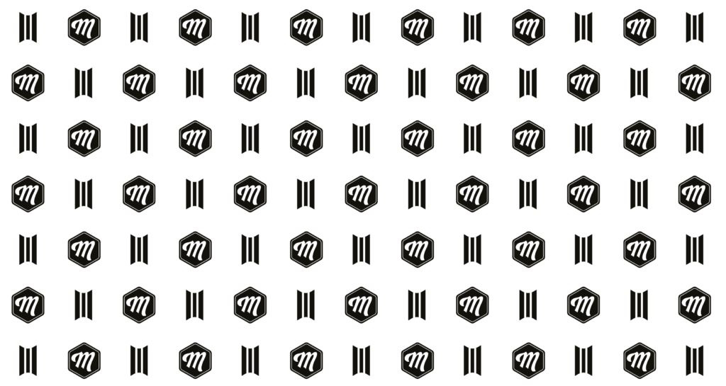
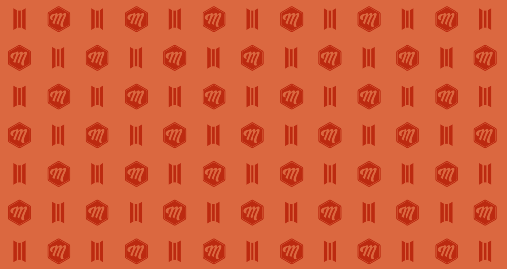
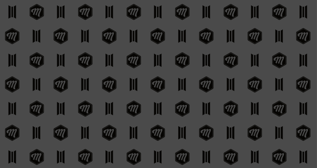
A strong visual system is defined not only by its logo, colors, and typography – but also by the subtle details that run like a thread through every brand touchpoint. Our brand pattern plays exactly that role.
It’s built on a recurring structure of hexagons, alternately filled with our “M”, the Swiss cross, or left empty to create breathing space. Discreet racing stripes add a sense of motion and individuality.
This pattern reflects our core values – Swissness, quality, character – and visually connects diverse applications across the brand. It’s deliberately subtle, meant to support content, not compete with it.
We use the brand pattern wherever visual depth, recognition, or a sense of identity is needed: packaging, print materials, background elements on the website, or branded POS displays.
Whether used light on dark or dark on light, the pattern is fully modular, seamlessly scalable, and consistently carries the visual DNA of Mootes.