The selection of the right visual and material elements is essential for a strong brand identity. Packaging conveys values, supports brand recognition, and ensures a consistent visual language. Mootes’ packaging is not just functional but an integral part of the brand identity, reflecting Swissness, high quality standards, and sustainability.
Packaging Design Guidelines
Mootes packaging is more than just a protective cover for our products – it is a key element of the brand experience. The design follows clear principles:
- Clean, masculine design: A minimalist yet well-thought-out composition inspired by classic and modern men’s grooming products.
- Consistent design elements: Racing stripes, hexagon shapes, and custom icons for each fragrance line.
- Functionality & usability: Packaging must be easy to handle, safe, and sustainable.
- Premium quality: Materials and printing techniques should reflect the high-quality standards of the brand.
Swissness in Packaging
All Mootes products are manufactured in Switzerland, and this is highlighted on our packaging with the “Swiss Made” branding element. This reinforces our high-quality standards, regional production, and commitment to sustainability.
- Placement: “Swiss Made” is prominently displayed on the back or side of the packaging, depending on product size and design.
- Design: Simple, elegant typography that blends harmoniously into the packaging design without being overpowering.
- Meaning: This label serves as a quality seal and strengthens customer trust in the origin and craftsmanship of our products.
Materials & Sustainability Aspects
Sustainability is a core value at Mootes and is reflected in our choice of packaging materials:
- Almost 0% plastic: Used only where necessary for safety reasons (e.g., PET containers for soaps in the bathroom).
- Primary materials – glass & cardboard: Glass bottles for beard shampoo and premium cardboard packaging.
- Minimalist packaging approach: No unnecessary materials to reduce waste.
- Recyclable & biodegradable materials: Ensuring an eco-friendly brand presence.
Design Elements for Packaging
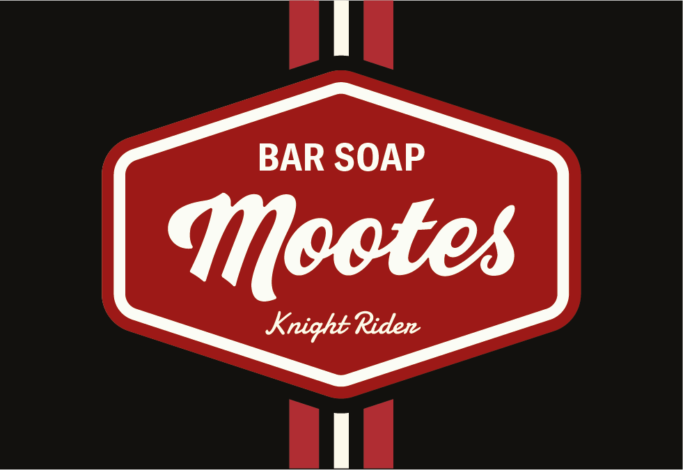
- Racing Stripes: Symbolising dynamism and a sporty-elegant look
- Hexagon Shapes: A structured design element that enhances brand recognition.
- Custom Icons: Fragrance icons for Mountain Pass, Hidden Beach, Night Rider, Ocean Drive, and the Black & White line for easy product differentiation.
- Primary & Accent Colours: Defined colour palettes to create a clear visual distinction between products.
 |  |
Typography on Packaging
- GT America as the primary font: Used for clear, masculine, and modern product labels.
- Damion as an accent font: Used selectively for product names or stylistic elements.
- Hierarchy & readability: Well-structured product names, ingredient lists, and usage instructions.
- Consistent application: Unified typography across all products to strengthen brand identity.
Why This Packaging Strategy?
- Enhances brand recognition with consistent design elements.
- Balances aesthetics with functionality, ensuring practical and premium packaging.
- Supports sustainability goals with eco-friendly materials.
- Communicates Swiss quality through refined design and premium materials.
This packaging strategy ensures that Mootes not only offers high-quality grooming products but also builds a strong and sustainable brand identity through thoughtful and aesthetically appealing packaging.